


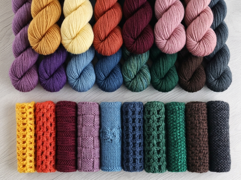
A stitch pattern can look completely different depending on whether it’s worked in navy or cream. Light yarn shows texture details clearly, making stitch definition pop. Dark yarn can make those same details harder to see, reducing the visual impact even when the technique is identical.
The Short Answer
Light-colored yarns generally reveal stitch texture more clearly, while dark yarns can make it harder to distinguish. Variegated yarns can pool unpredictably depending on the stitch pattern, creating unintended patterns. Gauge swatch with your actual project yarn to see how color interacts with your chosen stitch before committing to a full piece.
Main Steps
Color choice starts with understanding how yarn shade affects visibility. Light colors like white, cream, and pastels generally make stitch definition and texture easier to see, making them well suited to textured patterns like cables, bobbles, or popcorn stitches. The reason this matters is that your eye, and a camera lens, reads texture through the contrast between highlights and shadows. Dark yarns reflect less light, which can reduce the visible contrast between highlights and shadows and make stitch definition harder to see. Without strong highlights to distinguish raised areas from shadows, individual stitches can blend together, making them harder to distinguish both while you are working and in the finished piece.
That said, dark yarns can create dramatic contrast when paired with light shades in colorwork. Light-colored yarn is often recommended for beginners because stitch definition and small mistakes are generally easier to see, which can make learning new stitches or working intricate lace easier. For simple projects such as a single-crochet scarf or blanket, however, dark yarn can make minor variations in stitch size and tension less noticeable. The reduced visibility of individual stitch details can give the finished fabric a more uniform appearance, even though the underlying tension remains the same.
Variegated and self-striping yarns introduce a second variable: color pooling. The color repeats in the skein can align with your stitch count, creating stripes, argyle patterns, or blotchy sections you didn’t plan for. Different stitch heights and densities can change how those color repeats appear across the fabric, so single crochet may produce a different pooling effect than double crochet. The result depends on factors such as the yarn’s color-repeat length, stitch pattern, tension, and hook size.
| Step | What to do | Watch out for |
|---|---|---|
| Choose yarn shade based on stitch pattern | Light colors for textured stitches, dark colors for simple stitches or colorwork contrast | Dark yarn can make counting stitches harder while working |
| Swatch with project yarn in project stitch | Work a small swatch in the exact stitch you’ll use to see how color distributes | Variegated yarn may pool differently depending on the stitch pattern |
| Check lighting while working | Use bright, neutral light for dark yarns to see stitch definition | Warm light can shift how you perceive color contrast |
| Test color transitions in stripes or colorwork | Work a small sample with your planned color changes to check contrast sharpness | High-contrast pairs (light/dark) create harder edges than analogous colors |
Comparison / Options
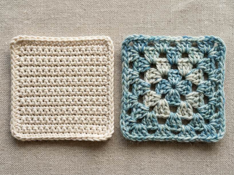
Acrylic yarn generally holds its color well through repeated washing, making it a popular choice for blankets, toys, and other projects that need regular laundering. Its synthetic fibers typically offer good colorfastness, although some acrylic yarns can still fade or release excess dye depending on the dyeing process, washing conditions, and exposure to heat or sunlight. Cotton yarn can also be highly colorfast, but some dyed cottons may fade over time or release excess dye during their first few washes. For structured projects such as bags or dishcloths, cotton can be a better choice when you want a firmer fabric and natural fiber feel, while acrylic is often preferred when easy care and color retention are priorities.
White and cream yarns can develop a yellowish or duller appearance over time, particularly when exposed to sunlight, heat, pollutants, or prolonged storage. Acrylic and other synthetic fibers can undergo discoloration through aging and environmental exposure, while natural fibers such as cotton and wool can also yellow or shift in tone under certain conditions. If color stability is a priority, avoid prolonged exposure to direct sunlight and store finished pieces in a cool, dry, dark place. For projects where aging and discoloration are a concern, mid-tone shades such as gray, beige, or soft pastels can make gradual color changes less noticeable than stark white.
Stitch height changes how color spreads across the fabric. Double crochet is taller and uses more yarn per stitch than single crochet, so changing to it can alter how the yarn’s color repeats align across the fabric. Whether this reduces or increases pooling depends on the specific yarn, stitch count, tension, and pattern. In variegated yarn, changing from single crochet to double crochet can alter the pooling pattern, but it does not necessarily reduce pooling. The catch is that double crochet creates a more open, drapey fabric, which isn’t ideal for structured projects like amigurumi or bags where single crochet’s density is the point.
| Color choice | Best for | Limitation | Alternative |
|---|---|---|---|
| Light yarn (white, cream, pastels) | Textured stitches, lace, cables | Can make tension variations more noticeable | Use off-white or light gray to soften imperfections |
| Dark yarn (navy, black, charcoal) | Simple stitches, colorwork contrast | Hard to see stitches while working | Work near a bright lamp or use a headlamp |
| Variegated yarn | Colorful projects without weaving in ends | Can pool unpredictably depending on the stitch pattern | Change stitch height, stitch count, or tension to alter the color alignment |
| Acrylic (any color) | Washable items, budget projects | White and cream can discolor over time | Choose mid-tone shades if gradual discoloration is a concern |
Common Mistakes
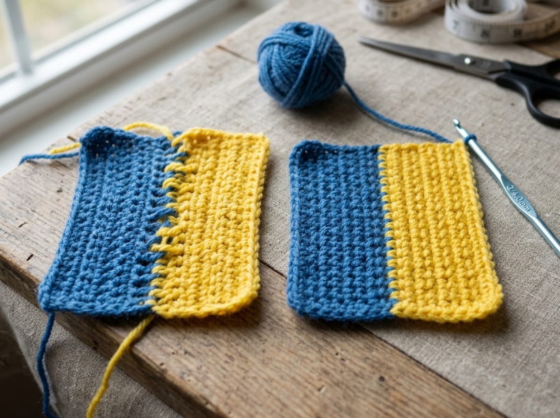
Most beginners choose yarn color based on what looks good in the skein, not how it will behave in the stitch pattern. A skein of dark purple might look rich and saturated on the shelf, but when worked in a complex textured pattern, the texture can become harder to see. The reason this happens is that textured stitches rely on shadow and highlight to create dimension, and dark yarn can reduce the visible contrast between them. Even so, if the project is a simple single-crochet blanket where texture isn’t the goal, that same dark purple creates a bold, cohesive look without making minor visual stitch irregularities as noticeable.
Another common error is skipping the gauge swatch when working with variegated yarn. The color repeat in the skein doesn’t predict exactly how it will appear in your project because pooling depends on factors such as stitch count per row, stitch height, tension, and the yarn’s color-repeat length. A variegated yarn that creates soft stripes in double crochet can produce a different pattern in single crochet. In practice, working a small swatch in your project stitch gives you a useful indication of how the colors may behave before you commit to a full piece.
Crocheters also underestimate how much lighting affects color perception while working. Dark yarn under warm light can look even darker, making it difficult to see where one stitch ends and the next begins. The fix is switching to bright, neutral light—daylight bulbs or a task lamp with a high color rendering index. That said, if you’re working on a long-term project and can’t control your lighting environment, switching to a lighter shade of the same color family can solve the visibility problem without changing the overall palette.
Troubleshooting
If your textured stitch pattern looks flat in the finished piece, the issue may be that the yarn shade is too dark to show shadow and highlight clearly. The fix is switching to a lighter shade—mid-tones like gray, taupe, or dusty blue can show texture clearly without the brightness of stark white. The root cause is that texture reads through contrast, and dark yarn can reduce that visible contrast. In contrast, if you’re committed to the dark color for aesthetic reasons, switching from single crochet to half double crochet may change the height and structure of the stitches, potentially improving how the texture catches light.
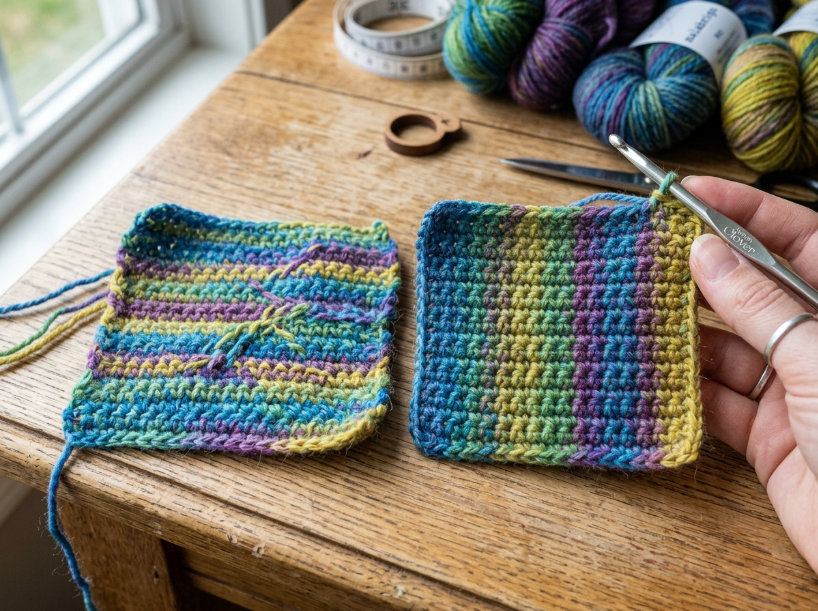
Variegated yarn pooling into unintended patterns can sometimes be addressed by changing stitch height, adjusting stitch count per row, or changing tension. Pooling happens when the color repeat interacts with the dimensions of the fabric in a particular way, creating stripes or other recognizable patterns instead of a random distribution. Switching from single crochet to double crochet can change the alignment between the color repeat and the fabric, potentially altering the pooling pattern. Alternatively, adding or subtracting a few stitches per row shifts the color repeat’s relationship with the row width. If the pattern requires a fixed stitch count and the pooling remains undesirable, another option is to choose a different variegated yarn with a different color-repeat length or color sequence.
If dark yarn makes it difficult to see stitches while working, the standard fix is better lighting. A clip-on task lamp with a daylight bulb positioned directly over your work surface can improve visibility. The catch is that this only helps while you’re actively working—if you need to check stitch count or alignment from a distance, the dark yarn may still hide definition. An alternative fix is marking every tenth stitch with a contrasting stitch marker, which gives you visual checkpoints without relying on being able to see every individual stitch.
| Mistake | Why it happens | Fix |
|---|---|---|
| Textured pattern looks flat | Dark yarn reduces visible shadow and highlight contrast | Switch to a lighter mid-tone shade or use taller stitches like HDC |
| Variegated yarn pools into stripes | Color repeat interacts with the dimensions of the fabric | Change stitch height, stitch count, or tension to alter the color alignment |
| Can’t see stitches in dark yarn | Insufficient lighting or unfavorable light conditions | Use a bright, neutral light positioned directly over the work surface |
| White yarn develops discoloration | Light, heat, pollutants, aging, and storage conditions can affect appearance | Store finished pieces away from prolonged direct sunlight |
Questions You Might Still Have
The best color choice for most crocheters depends on whether stitch texture or color contrast is the priority. If you’re working a textured pattern like cables or popcorn stitches, light-colored yarn in the cream-to-light-gray range shows the pattern clearly without the harshness of stark white. The technical reason is that light yarn generally makes the highlights and shadows of the texture easier to distinguish, while mid-tones can make minor tension variations less noticeable than very light colors. In practice, if you’re making a simple project like a single-crochet blanket where texture isn’t the focus, dark yarn creates a cohesive, bold look and can make small irregularities less noticeable.
The relationship between the yarn’s color-repeat length and your row width can strongly affect the resulting pattern. Certain repeat lengths may create stripes, pooling, or other recognizable patterns, while others may produce a more scattered color distribution. Changing the stitch height or stitch count can alter this relationship and change the resulting effect. If budget is the priority and you already have variegated yarn on hand, experimenting with stitch height or a small swatch is faster and cheaper than buying new yarn.
Questions You Might Still Have
Q: What is the easiest way to choose yarn color for a textured crochet project?
Light-colored yarn in the cream-to-light-gray range generally shows stitch definition clearly without the harshness of stark white. Dark yarn can make cables and bobbles harder to see because it reduces visible contrast between highlights and shadows. If you’re learning a new textured stitch, start with a light or mid-tone shade so you can see the stitches clearly while working and in the finished piece.
Q: How long does it take to see if variegated yarn will pool in my project?
A small swatch worked in your project stitch can give you a useful indication of how the yarn may behave before you commit to the full piece. Make the swatch large enough to reveal several color repeats rather than relying on a fixed size. The time required varies depending on stitch height, yarn weight, hook size, and your crochet speed. Skipping the swatch means you may not discover an unwanted color pattern until you’re several rows into the project.
Q: What hook size and yarn weight do I need for color-focused crochet projects?
Hook size and yarn weight depend on the project type, not the color choice. Textured patterns that rely on stitch definition work best with a hook size that creates the fabric density required by the pattern—often within the range recommended on the yarn label. Colorwork projects like stripes or tapestry crochet should also follow the pattern’s recommended yarn and hook combination because fabric structure and color contrast both affect the finished result.
Q: What are the most common mistakes when choosing yarn colors for crochet?
The most common mistake is choosing dark yarn for a textured pattern where stitch definition matters. Dark colors can make texture harder to see by reducing visible contrast between highlights and shadows. Another frequent error is skipping the swatch with variegated yarn, which means you may not discover how the color repeat interacts with your stitch pattern until you’re deep into the project. A third mistake is assuming white yarn will remain unchanged in appearance forever; white and cream yarns can become duller or develop discoloration depending on the fiber, colorant system, exposure conditions, and storage environment.
Q: How do I fix it if my yarn color hides the stitch pattern?
If the yarn is too dark to show texture clearly, switch to a lighter mid-tone shade in the same color family. Gray, taupe, or dusty blue can show texture clearly without the brightness of stark white. If you’re committed to the dark color, switching from single crochet to half double crochet or double crochet changes stitch height and fabric structure, which may improve how the texture catches and reflects light.
Q: Is there a faster method for testing how variegated yarn will look in a project?
Working a small swatch in the project stitch is one of the most reliable ways to test how variegated yarn may look. Holding the skein up or wrapping it around your hand doesn’t reproduce the way the color repeat interacts with your stitch count, row width, tension, and stitch height. Make a swatch large enough to show several color repeats so you can see whether the yarn creates stripes, pooling, or a more scattered distribution in your chosen stitch.
📅 Last reviewed: August 2026
Summary
Light yarn generally shows stitch texture clearly, while dark yarn can make it harder to see. Variegated yarn can produce different color patterns depending on stitch height, stitch count, tension, and color-repeat length. Swatching with your actual project yarn gives you a useful indication of how color behaves in your chosen stitch before you commit to the full piece. The main recommendation—light yarn for textured patterns—changes when the project is simple and color contrast matters more than stitch definition. This article is reviewed every 12 months.

